Interactive Visualization Dashboard
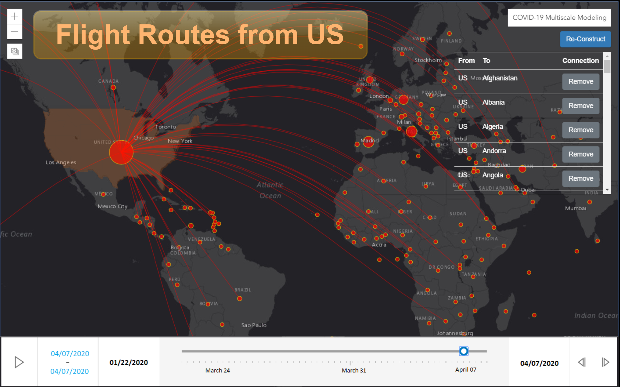
The above figure shows a specific use case where a user has hovered over and clicked the US node. By doing so, the visualization platform has shown the active outward flight routes from the US to other countries on different continents. For every active route (i.e., edge in the multi-scale graph), the dashboard allows the user to remove it (e.g., enforce a border closure policy for a particular country) and then reconstruct the multi-scale graph by hovering and clicking the reconstruct button. This would now allow the user to observe the implications after enforcing, for example, the border closure policy for one or more countries on the spread of COVID-19. The red circular disks are the nodes with varying sizes reflecting the number of active COVID-19 cases in that node (i.e., the bigger the disk size, the higher the number of active COVID-19 cases). The slider at the bottom enables the user to go back and forth between days and months to visualize the spread of COVID-19 over time, with or without the presence of any enforced policies.